Logo with pay-off
The logo may be combined with Q-Park’s pay-off ‘Quality in parking’. The size and position of the pay-off with logo is fixed. Only in highly exceptional circumstances may the pay-off be placed under the logo.
The preferred position of the logo with pay-off in all executions is at the bottom right of the page.
Download Q-Park logo with pay-off
Figure 6 Logo with pay-off
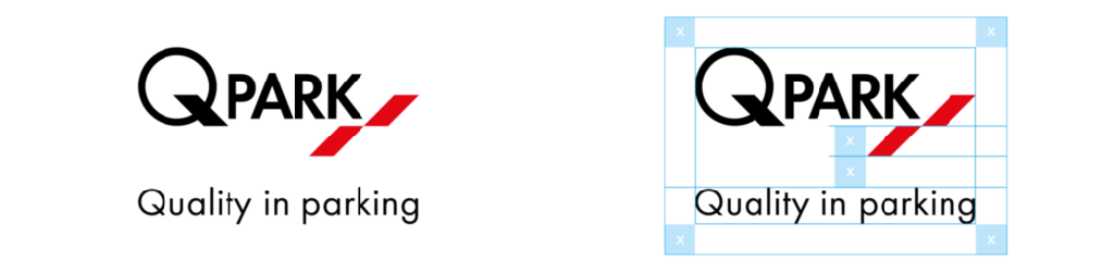
Safe zone
Q-Park sells space and space is part of the Q-Park Brand. It is vital to place the logo in its own space without adding other graphic elements. To help you get this right, we have defined the minimum space to surround the logo, we call this the safe zone. It gives the Q-Park logo the space it deserves to convey our recognised quality image.
You may not place other graphic elements in the Q-Park logo safe zone.
To calculate the minimum free space surrounding the logo, take the height of one of the illustrative angled parking spaces, = x as shown in figure 2 and add this free space to all sides of the logo. This safe zone is always in proportion to the size of the logo, however large or small.
Figure 7 Safe zone around logo with pay-off
Use of colour
For wide-ranging applicability, clarity and strength, the use of colour in the basic logo is restricted to two colours: black (or white in reverse use) and red. Black and grey may only be used if colour is not possible. For colour references, see the Primary brand colours section.
Figure 8 Master and reverse logo with pay-off
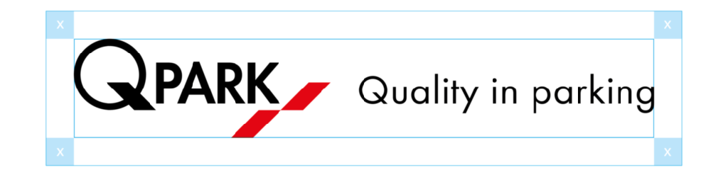
Stacked logo
If width is an issue, the pay-off may be stacked.
Figure 9 Stacked master logo with pay-off