Descriptions
When designing a signage-plan house style rules and principles must be applied.
All designs regarding signage and house style must be approved by Corporate Car Park Design (CCPD) and MH1.
In general
Readable height - most PFs are low of clear height, signs can be difficult to fix while still being readable for customers. The clear height underneath a sign must never be lower than the clear head height of the PF.
Signs for motorists may at the lowest height of 2.10 meters if this increases readability.
Signs for pedestrians may not be lower than the clear height of doors.
If the available height is insufficient, you may suspend angled signage from the ceiling, gaining about 11 centimeters clear height.
Readability and glare - glare from illumination is one of the biggest problems we experience as it makes signs unreadable. Only one type of foil solves this issue, make sure your sign manufacturer uses these materials:
Cover the sign (aluminum plates) with mat white foil type 3M 3635-20.
Finalise the sign with translucent mat foil, either
Red 3M 3630-43 for motorists
Green 3m 2630-106 for pedestrians
It is up to the sign maker to place white information (3M 3635-20) on the coloured foil or is cut-out of the coloured foil.
New developments on how to assemble the sign
Normally the sign is assembled out of a core of WBP plywood 18mm and painted black + two plane aluminum plates of at least 2mm glued on and covered with mat white foil type 3M 3635-20.
New is a type of alu-bond with a mat white coating. This may be used as well and may create a cost saving.
Figure 62 Signage angled from the ceiling
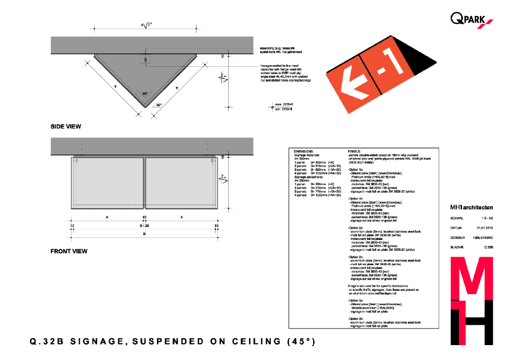

To avoid glare, use the right mat foils.
External signage
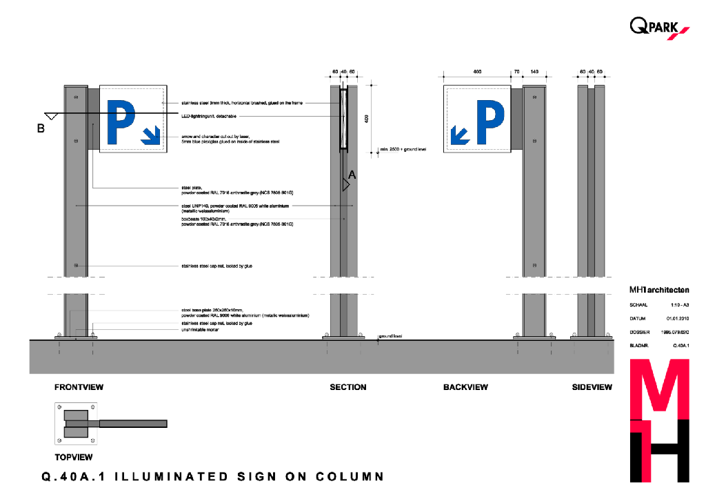
Motorists - an illuminated Q-Park P-sign signpost.
Sometimes it will be the last sign as part of and in addition to Variable Message Signs (VMS) or Parking Guiding Systems. If so, you may decide to not use the FULL/SPACES indicator.
Depending on the local situation it may be fixed on a column, a facade or an element of our portal frame.
These signs are traffic signs and need to attract as much attention as possible. Please note that in most cases local planning consent and permits are required.
These signs are specifically designed per parking facility (PF) by MH1 and/or CCPD.
Pedestrians - an illuminated sign for night entrance
When customers are finding their way back to the PF, a blue P-sign guides them to the pedestrian entry.
The sign shows the name of the PF and our Q-Park logo.
When a pedestrian entry sign cannot be fixed to the facade or a column near the entrance, there is a more sophisticated solution for historic areas.
These signs are specifically designed per parking facility (PF) by MH1 and/or CCPD.
Figure 62 Illuminated P-sign for motorists on column
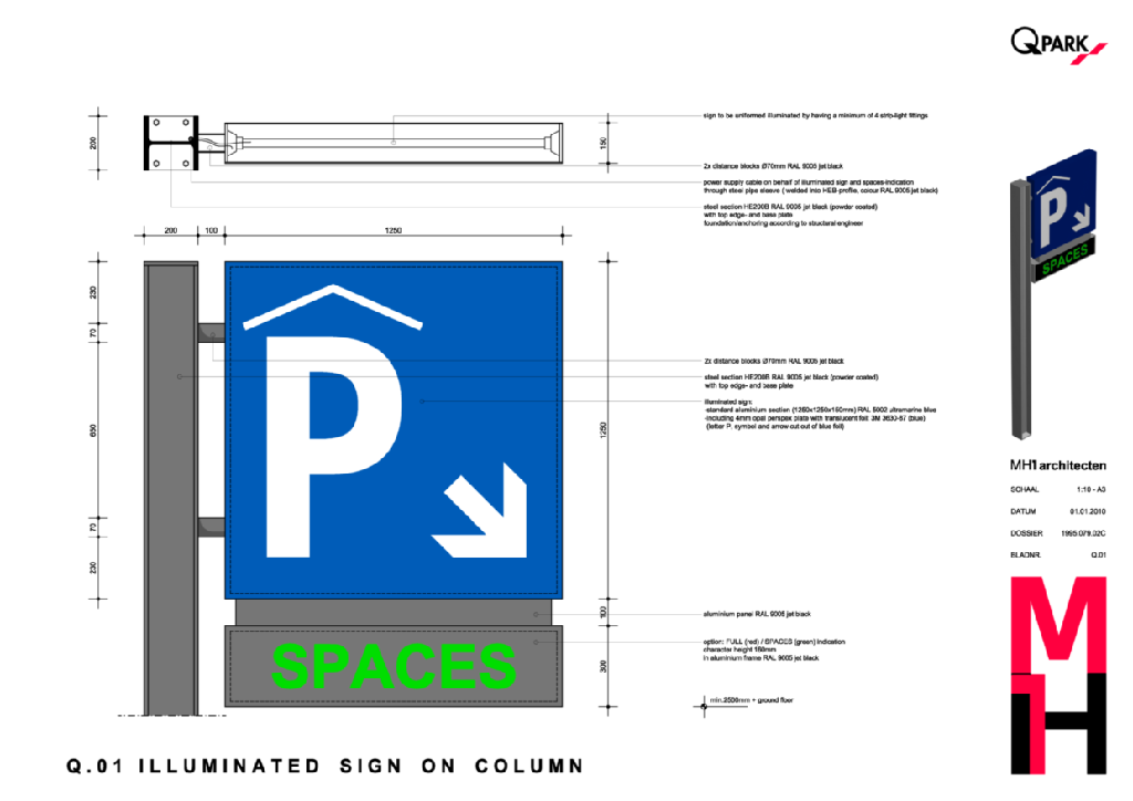
Figure 63 Illuminated P-sign for motorists on facade
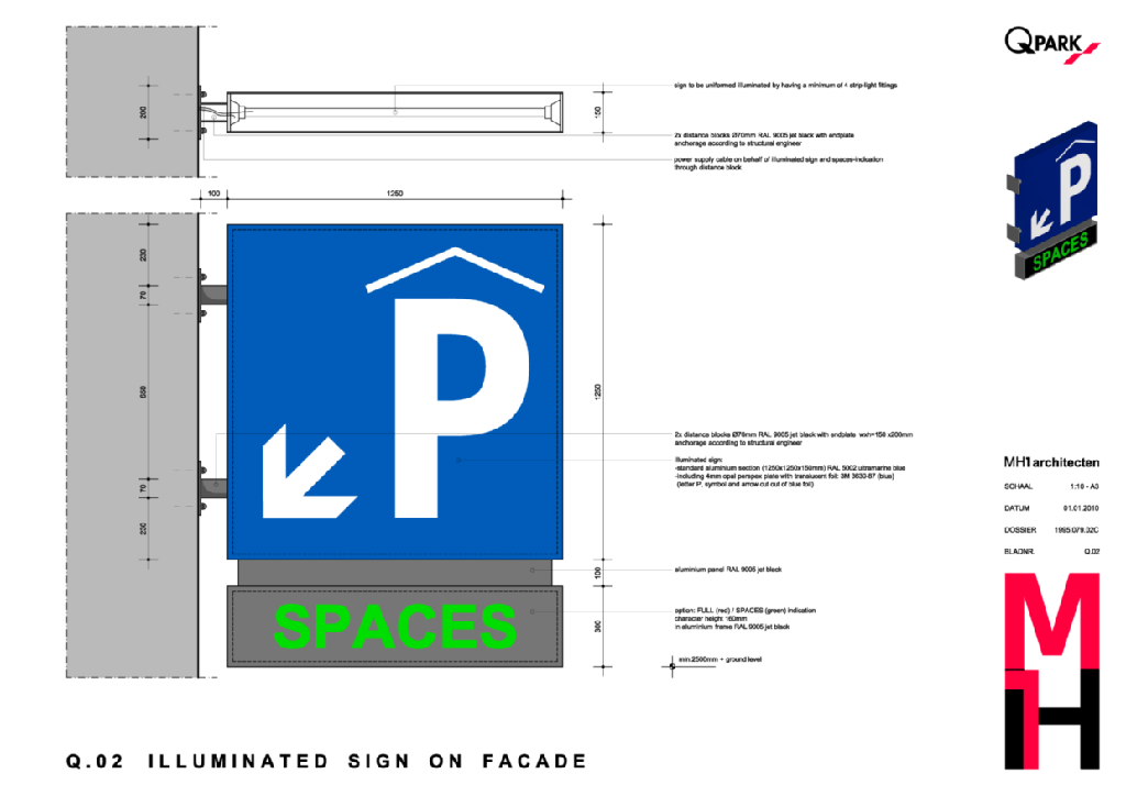
Figure 64 Illuminated P-sign for pedestrians on column
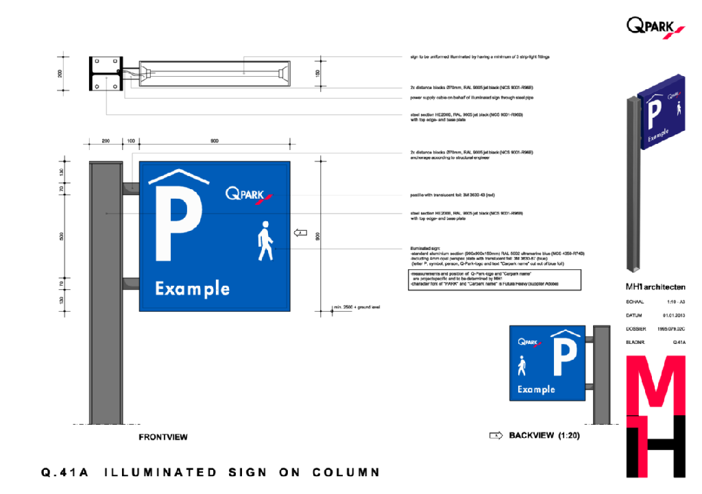
Figure 65 Illuminated P-sign for pedestrians on facade
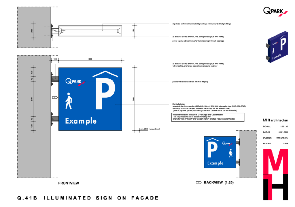
Figure 66 Illuminated P-sign for pedestrians on column, historic sites
Sandwich board / Windmaster frames
For use when a temporary reference to a parking facility (PF) is needed. They may be placed on-street yet local permits may be needed for placement.
For use when parking floors need to be closed for maintenance, cleaning or energy saving, to redirect customers.
Visuals of boards, frames, posters - posters without 'roof' is additional costs/variables.
Portal frames - indicate the entrance to a parking facility, designed per PF.
U-shaped
Placed at the top of the entrance for motorists.
Includes Q-Park logo and PF name.
Includes height restrictor and traffic signs (diameter 180mm).
Depending on the local situation, a VMS-module is integrated to show parking space availability.
L-shaped
Often used if the motorist entrance is a one-way lane only.
Façade - designed per PF by CCPD and/or MH1, often consent of architect or owner of the building is required
When the motorists entrance is integrated in the façade of a building, the PF name is placed separately, combined with our Q-Park logo.
The height restrictor and traffic symbols are positioned in the façade opening.
Depending on the situation three options of façade signing can be applied:
1) Checkerplate with black letters;
2) Black panels with stainless steel letters;
3) Letters placed directly onto façade (stainless steel or black logo & name). Lighting of this type of signage is a point of attention and is possible through internally (light box) or externally placed luminaries.
Internal signage
Internal signs for motorists and pedestrians are made of square sections.
Motorists: used colour is red (3M 3630-43) and the standard measurements are 300 x 300 mm.
Pedestrians: used colour is green (3M 3630-106) and on parking floors the measurements are 250 x 250 mm in standard situations. For measurements in staircases a smaller size of 200 x 200 mm is more sophisticated.
Terminology
Because of the different languages used it is important that the same terminology is being applied. Where possible a different term is used for directing to the exit for pedestrians and for motorists (see list ). For parking facilities in Belgium the French or Dutch language (or both) are to be used, depending on the location of the facility. Also the terms for ‘parking’ and ‘levels’ are shown in each country language.
As no parking facility is the same and each of them are located in different surroundings, the Customer Guiding System is always project specific and needs to be determined per project. Signage for motorists is almost everywhere the same, because signs for “parking”, “level” and “exit” are univocal. For pedestrian signage this is different:
When a parking facility is not connected to any other destination and is completely solitaire, the signs for pedestrian exits should be “way out” (other country specific languages according to Figure 1). If more than one pedestrian exit is available, the addition of the street name or location is added (respective signs #026 and #027).
When a parking facility is integrated in a shopping centre or an office building it is preferred to use the term “entrance” with a specific addition to increase recognisability for our customers.
If an exit for pedestrians leads straight to a office or shop from a third party with a recognisable brand, it is recommended to use their logo on the signs. For execution of these signs see chapter F. Signage for third party-references in Standard principles.
If parking facilities have an international character or attraction, another language can be added to the country specific language (see chapter E. Multilingual signage).
Standard principles
Arrows
Always make sure an arrow is pointing towards the direction of the destination for customers (pulling away from the information on the sign). The arrow-sign should be on that particular side of the sign. This makes the information on the sign more easily to read.
In a situation where the arrow is pointed straight forward it is in principle positioned on the left side of the information. When a ‘pulling’ arrow is used in the same lane, make sure all arrows in one lane are on the same side of the information.
If signage in two different directions is needed, the arrow of the left combination will be positioned on the right side of the information. This is done to make the giving information faster and more clear to read for motorists and pedestrians.
Assembly
The typical square-shaped signs are assembled of one-module sections with an addition of 10 mm. The assembly of longer signs is as shown in the figure below. When a sign of four sections is used, it is only combined with an arrow-sign, so no more then five sections in total are used.
The information giving on the signs should be carefully selected. When to much information is giving, customers will not read/see any of it. Therefore preferably no more than four sections are to be assembled at one position, pointing towards a particular location. When two, three or four sections are combined in one sign, they are mounted 10 mm apart from each other.
Mounting
As also described in the Procedures A and B of the Customer Guiding System, part 3.1, it is essential to assess the concept signage-plan at the actual site. It can occur that lighting or ductwork is present, where signs are planned, or even worse, that the desired clear height is not present. Therefore the check on site is necessary and essential in designing a signage-plan.
In standard situations where suspended signage is used, it needs to be mounted between 2.1 metres (minimum) and 2.2 metres (maximum) above the parking floor. When the clear height for vehicles is more than 2.2 metres, the height of the signs must be adjusted to the clear height in the parking facility including an addition of 5 cm.
In parking facilities where, for some reason, the minimum height of 2.1 metres can not be achieved, it is possible to use ceiling mounted signs. These signs are placed under an angle of 45 degrees and are mounted onto the ceiling. By doing so a saving in height of approximately 11 cm is gained (see Q drawing Q.32B and Figure C.2 below).
Distance
When information towards two different directions is needed, it is necessary to separate these two directions with an in-between distance of 10 cm.
Furthermore signs are repeated longitudinal with an in-between distance of 50 metres for motorists and 30 metres for pedestrians. This distance is also depending on the clear lay-out and routing of the parking facility. Regarding the amount of signs the principle ‘less is more’ needs to be applied. Where crucial decisions in routing are to be made, signs are needed.
Again, before executing the work, a concept-plan needs to be controlled on site. This check needs to clarify if all proposed signs are correctly located and if it is possible to mount them. Also the function of the sign can be assessed by taking the surrounding signs in consideration.
Multilingual signage
At sites where two or more languages are to be used, an addition of a section is made. The length of the sign must not exceed five sections. If signage to services (lifts, payment equipment, lodge) is also needed it must be placed in a new sign on a second location.
Other services need to be displayed separately when five sections (as shown in Figure E.1) are already used.
Third-party signage - see different chapter
Backside of signs
The backside of signs is in principle used to inform customers about the routing direction. Wrong-way traffic signs are applied on the backside of these signs (Figure F.1).
When no information needs to be shown on the backside of a sign, the used colour for these signs are the same as the figures G.2 and G.3 (aluminium gray, RAL 9006). In combination with the colour scheme of the ceilings it will result in a more calm surrounding.
Bicycle signage
It is possible that a facility for bicycle parking is integrated in a parking facility. When this occurs it is strongly recommended to have a separate elevator, ramp or stairs for entrance and exit to and from the parking facility with a bicycle. This way of accessibility should never be combined with the entrance for motorists, but can be combined with the pedestrian entrance. Facilities for bicycle parking should always be separated from parking floors to prevent customers cycling around.
When references to certain entrances or areas to bicycle facilities are needed, it is to be combined with the pedestrian signage and is therefore in green. Bicyclists are not allowed to cycle in the parking facility and should only move around on foot. The next symbols are designed for this purpose.
Usage of etch foil
An often used house style element is the etch foil on glass doors and panels. The underlying thought for usage of this etch foil is that it is applied on fully glazed doors and panels, where customers might overlook the glass and by mistake walk into it. To make a difference between doors and panels, the ‘QPark’- logo is to be applied on glazed doors and the ‘striping’ is applied on glazed panels.
The etch foil is not to be applied on every part of glass in a parking facility. Only where glass panels from floor to ceiling are used and where there is the safety issue that customers walk into it by mistake.
Some examples:
The glass in the lodge of the Parking Host, above the checkerplate, is no area where people might walk into, so no etch foil is to be applied.
Fully glazed door in a public area is to be provided with a ‘Q-Park’ logo in etch foil;
Fully glazed (floor to ceiling) walls around a pedestrian entrance or near the lodge are to be provided with the etch foil ‘striping’.

When a service for bicycle parking is integrated in a parking facility, always contact Q-Park Holding for the design and location of the facility and entrances.