Logo don'ts
Only use the logo as downloaded, never attempt to change it in any way.
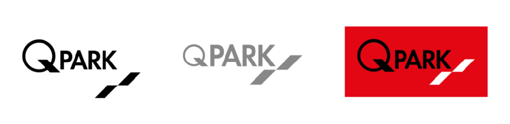
The following logo examples may look okay to the untrained eye, but these are wrong because:
In the black example, the ‘angled parking spaces’ are disconnected.
The logo may not be monochrome grey, and the Q is too small.
In the red example, the ‘angled parking spaces’ must be black.
Figure 86 Logo don'ts

The black logo on a red background is only permitted for company clothing and litter bins in parking facilities.
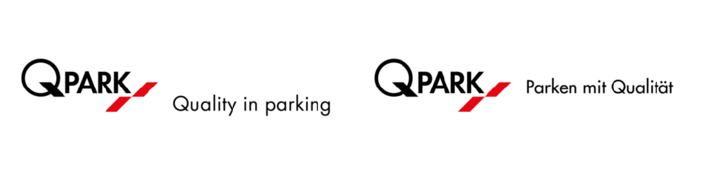
These logo's with payoff are wrong because:
In the left-hand example, the payoff is not aligned properly.
In the right-hand example, the payoff is translated.
Translating the payoff 'Quality in parking' is not allowed.
Figure 87 Logo and payoff don'ts
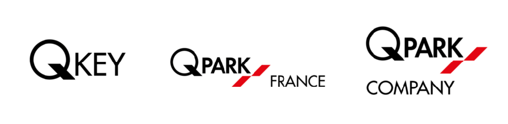
The following logo-name variants are wrong because:
We do not change or bastardise the company name or logo in any way.
We do not add country names to the logo.
We do not add company names to the logo.
Figure 88 Logo and naming don'ts
No deviations of any kind from or changes to the logo or its use in combinations are permitted.
The logo is never displayed with or incorporated into any other image or text in altered form.
In the event of acquisitions, mergers and other forms of participation, the Q-Park brand will be introduced throughout all aspects of the business concerned.