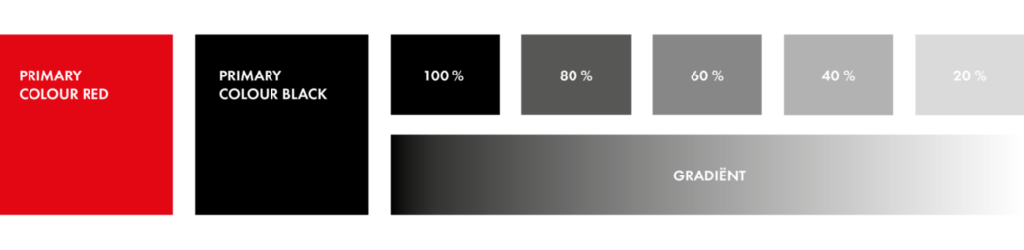
Primary colours
The Q-Park primary brand colours are the colours we use in the logo and as element in various expressions for recognition. Of the logo colours, red stands out. Red also stands for energy, passion, strength, warmth, speed and leadership.
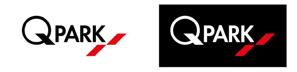
Figure 17 Q-Park logo colours
Black is the second primary brand colour. Where appropriate, you may also use grey tint or a percentage of black.
White is the most dominant colour in Q-Park expressions, it stands for space, fresh, open and clarity.
For wide-ranging applicability, clarity and strength, the colour in the master logo is restricted to two colours: black (or white in reverse use) and red.
Download colours for Adobe Indesign, Illustrator and Photoshop
Figure 18 Q-Park Primary Colours
Colour codes for Q-Park red:
CMYK: C0 M100 Y100 K0 – for full colour printing
Pantone: PMS 485 – for printing
RAL: RAL 3020 – for painting
RGB: R217 G3 B39 – for office applications
HEX: #D90327 – for web design
3M: 3630-043
Figure 19 Primary brand colour Q-Park red
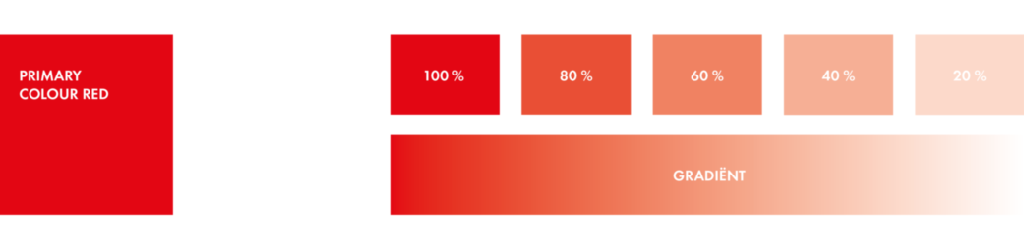

If it is not possible to use colour in the logo, red may be replaced with 60 % black
The colour red is the most recognisable (distinguishing) colour and is used as an accent.

Red may only be used as a full background colour on certain clothing items and the Q-Park litter bins. When using the logo on a red background, use the black monochrome logo.
Colour codes for Q-Park black:
CMYK: C0 M0 Y0 K100 – for full colour printing
Pantone: Black – for printing
RAL: 9005 – for painting
RGB: R0 G0 B0 – for office applications
HEX: #000000 – for web design 3630