Guidelines
Dos and don'ts
In general, parking facilities have low ceilings which complicate the photoshoot and make shots taken with wide-angle lenses look very artificial. Consider the following when planning and taking photos in our parking facilities:
We prefer photos not to be taken with a wide-angle lens so that a more realistic image is portrayed.
Vertical elements such as columns and walls must appear vertical
Photos should be taken with the lens pointing horizontal to prevent visuals appearing tilted.
Overview photos should be captured with reduced depth of field (DOF) settings.
Close ups, details or action photos can be captured with higher DOF settings to emphasise the theme of the visual.
Be cautious when taking photos with a slow shutter speed, or long exposure, and thus creating a motion effect. Always take the same shot with a fast shutter speed, short exposure, without motion.
Avoid taking high contrast shots as Q-Park wants the colours to be as realistic as possible.
Some examples to clarify our wishes: dos (Y), don'ts (N) and points for extra attention (!).
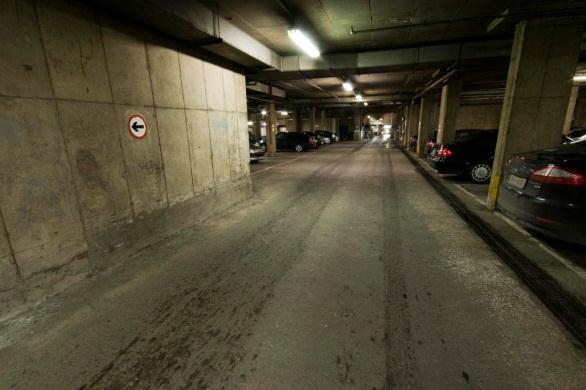
N Walls and columns are ‘tilted’, which looks artificial
N Picture taken from too high a position, lower the camera
Y Elements visible are good (lighting, ventilation, former colour scheme)
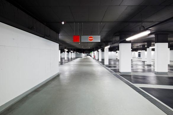
Y Walls and columns are vertical
N Visual has very high contrast; ceiling seems black and walls seem white
N Parking deck is empty
N Visual is shot against the traffic flow with prohibition sign visible
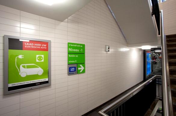
N Visual is shot with a wide-angle lens, which creates unrealistic ratios (A1 frame seems square)
Y Good example of ‘house style’ elements and materials in stairwell
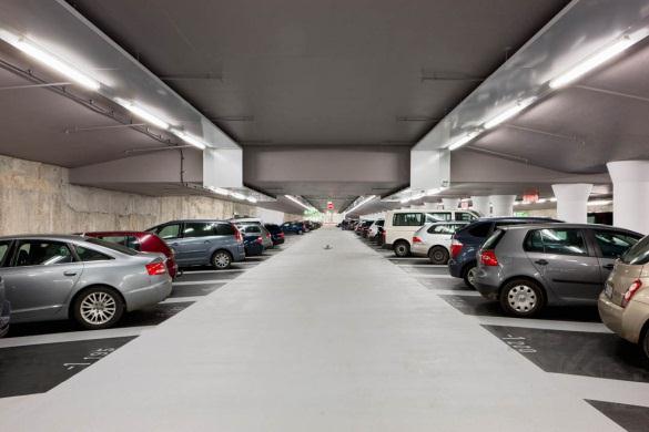
N Visual is shot with a wide-angle lens, which creates unrealistic ratios
Y Good example of occupied parking floor
! Visual is shot against traffic flow, although no prohibition signs are visible
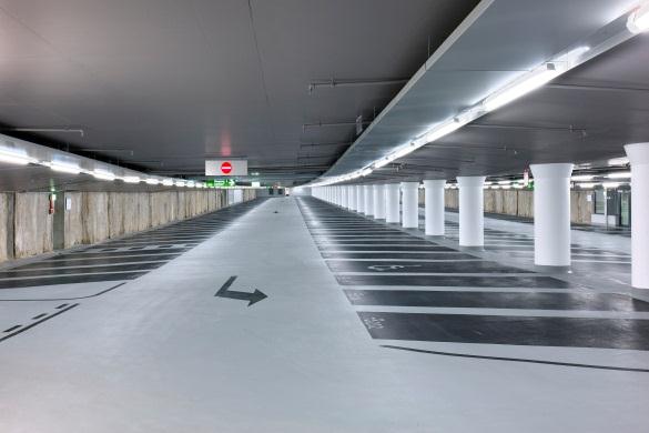
N Empty parking deck --> time of visit too short after opening?
Y Elements visible is good (lighting, signage, colours, column free)
N Visual is shot against the traffic flow with prohibition sign visible.

Y Good example of DOF usage
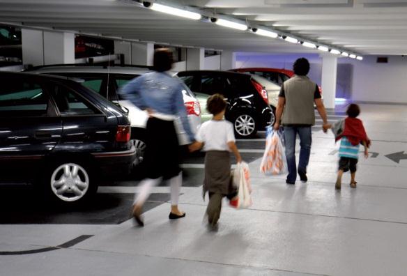
Y Very usable visual, showing: Occupied parking floor with cars, customer movement, colour scheme and lighting
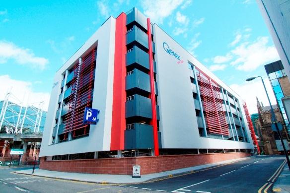
N Visual is shot with a wide-angle lens, which creates unrealistic ratios
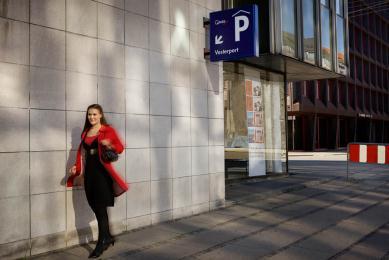
Y External signage is included and well visible
Y Elevations which show the function of the building.
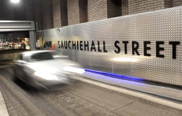
! Be cautious when using slow shutter speeds for visuals, always capture same visual without movement
N Blue light fitting is partially defect, make sure a maintenance check-up is done prior to photoshoot
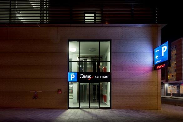
N Wide-angle lens creates unrealistic ratio of blue P-sign on the corner
N Light fitting in staircase level 1 is defect and should have been repaired prior to photoshoot
Y Visual taken by night time to emphasise entrance
Capturing the Q-Park themes
When a photographer is commissioned to make visuals of a parking facility, please ensure that all themes are captured. The themes concur with IDEFIX directories.
Members of the Real Estate Project Team who were involved during construction and/or renovation are familiar with the site and may have relevant information about points of attention.
Marketing managers should be contacted prior to the photoshoot.
Building structure
The physical structure of the building should be captured (e.g. concrete or steel columns, beams, floor slabs) .
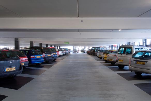
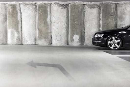
Entrance – Motorists
Directional signage (street signage/PRIS) and house style portals or gantry signs at the parking facility entrance.
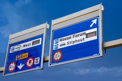
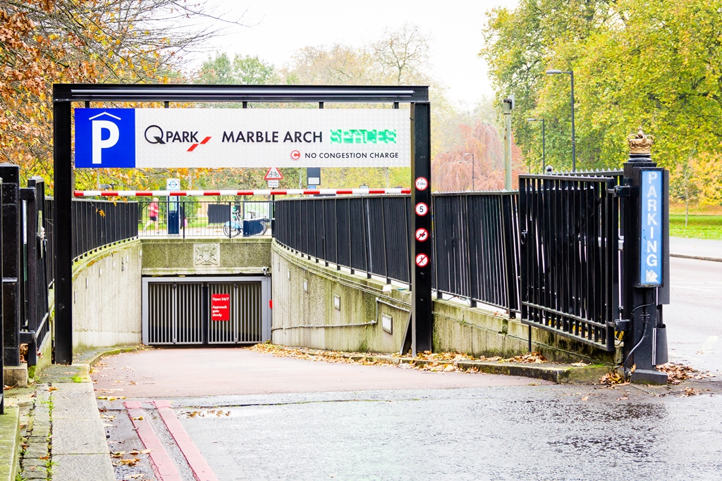
Entrance - Pedestrians
Show all car park access options. Include house style signage directing customers towards these entrances (e.g. stairs, lifts, escalators).
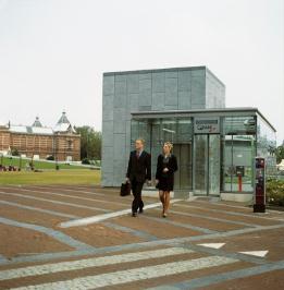
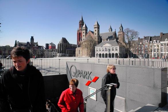
External design
The parking facility exterior in its surroundings is often an architectural challenge and makes good publicity material.
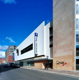
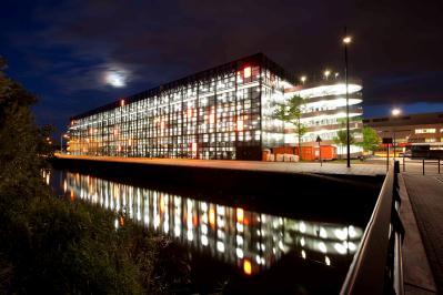
House style examples
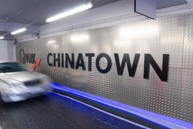
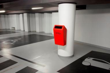
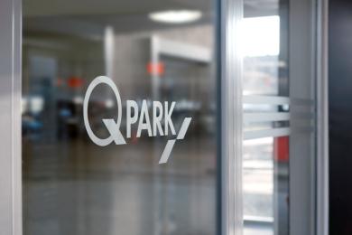
Typical house style elements are highly appreciated. They should be captured on the visuals (in overviews with their surroundings as well as in close up photos).
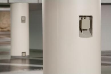
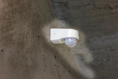
Mechanical and electrical (M&E) systems
These visuals are useful to help describe the M&E requirements in parking facilities.
Internal Design - Motorists
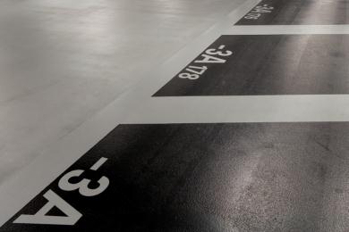
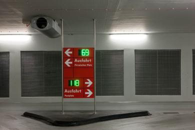
Overviews and details of signage, floor coating and parking deck(s).
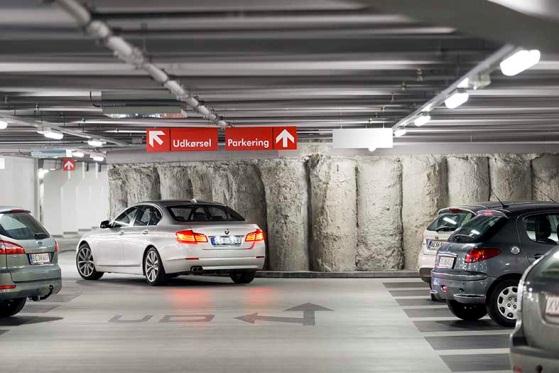
Internal Design - Pedestrians
The way pedestrian entrances are designed (and indicated) is very important as each solution is designed per project, but within our house style.
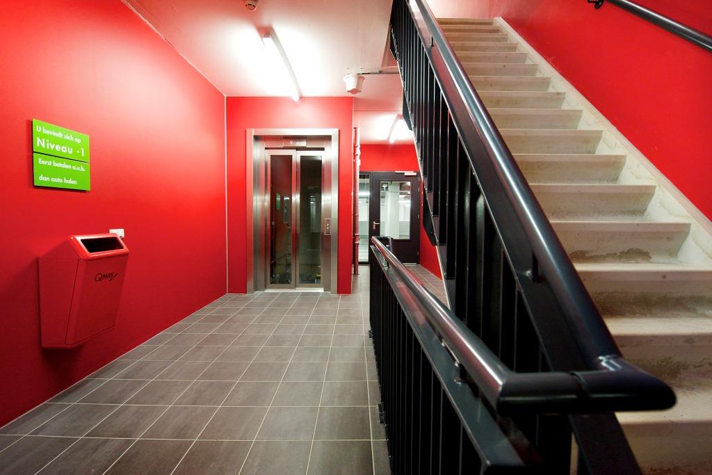
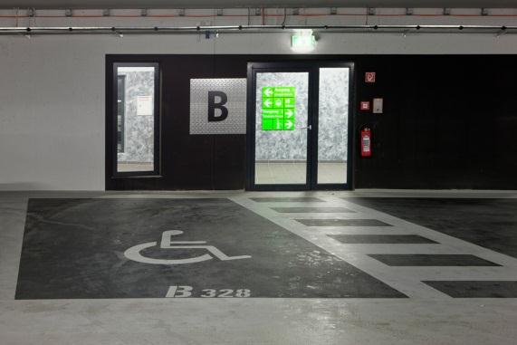
Include visuals of the main entrance and access to other floors, such as lifts, stairs and escalators. Be sure to capture the design, signage and materials used too. Customer activity in these areas is very much appreciated.
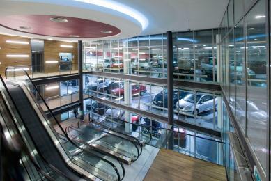
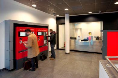
Lodge and hosts
The lodge areas are always typical and should reflect our customer friendly approach.
Interaction between customers and Parking Hosts (in Q-Park clothing) are highly appreciated.
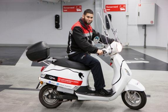
Q-Park service teams (in Q-Park clothing) in action are important to capture.
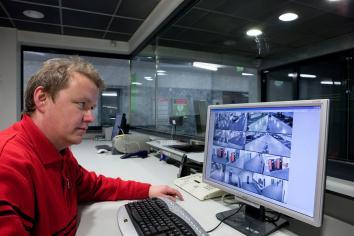
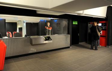
Parking equipment
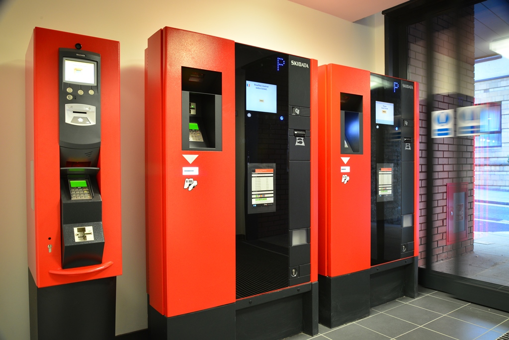
As part of the house style and to stand out in its surroundings, our parking equipment is red.
A great deal of effort is put into the positioning of the equipment and how it is integrated into the structure.
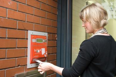
Access and exit barriers, pay stations and entrance door readers should all be photographed showing their surroundings.
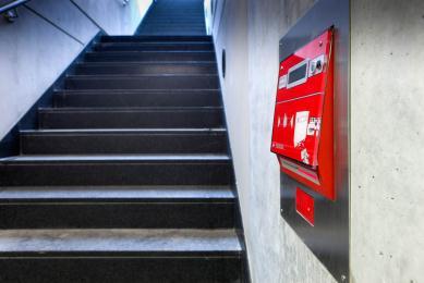
People
In addition to visuals of parking customers we also require pictures of people in the vicinity of the parking facility (e.g. people in shopping centres, offices, hospitals, using public transport, and similar situations). This is an excellent way to visualise activity in and around the parking facility .
Services
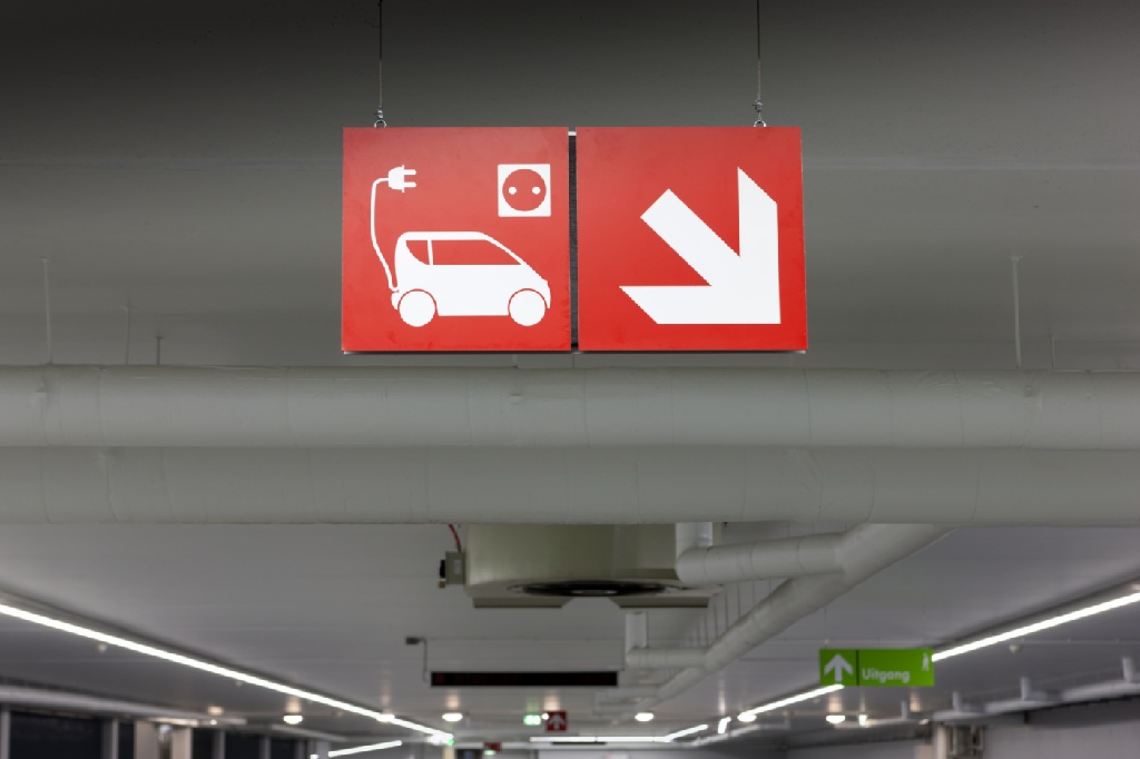
The services we offer vary from friendly on-site employees, toilets, AEDs, umbrellas, jump leads, car valeting, electric vehicle charging points, cleaning, payment options, to support from the QCR. It is important to capture the services available.
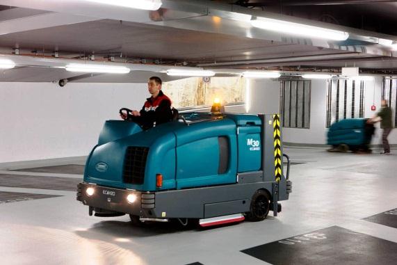
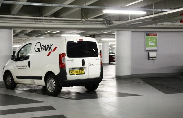
Recognisable Q-Park fleet is also a relevant part of our services.
Special features
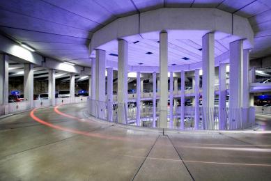
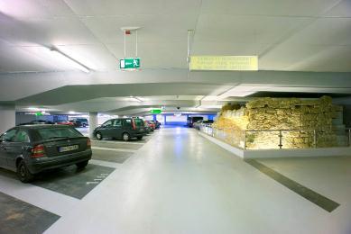
Some parking facilities have architectural features, archaeological excavations, green walls or extraordinary elements, capture them as they are highly appreciated by Business Development and other commercial activities.
Surrounding area
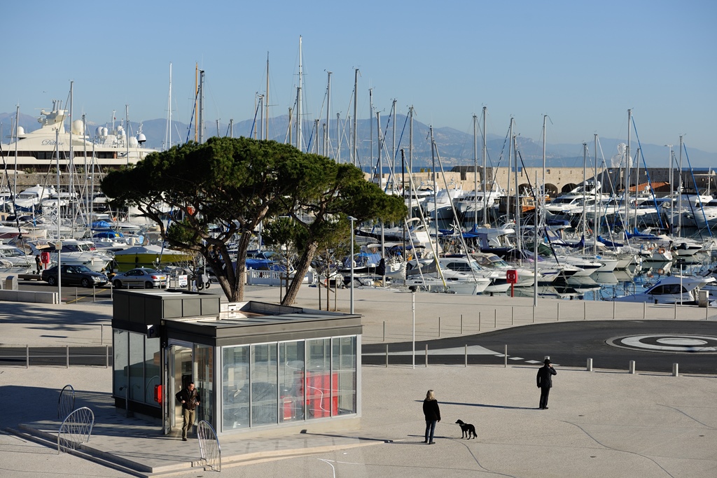
The surrounding area is as important as the parking facility itself. Squares on top of underground parking facilities, shopping centres, special points of interest or attractions to visit in the vicinity are to be included in the photoshoot.
Traffic signs (country specific)
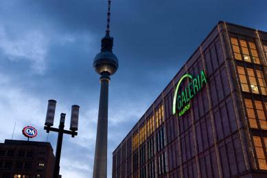
Specific on-street signage should be captured too, for example showing parking routes and/or numbers of vacant parking spaces.
Other themes to consider:
Communication tools
CSR events and activities
Pricing strategies
Promotional activities
Training
