Logo
The Q-Park name was introduced in 1995. The Q-Park logo dates from 1996 and its brand identity elements date from 2004. The Q-Park logo is a stylised name with three illustrative ‘angled parking spaces’ and its accompanying colours (black, red and white) are always used in the same way.
Figure 1 Logo

Safe zone
It is important to give the logo space without adding other graphic elements. A safe zone has been defined.
The safe zone is defined as the height of one of the illustrative angled parking spaces – we refer to this height as x. This safe zone always surrounds the logo and is always in proportion to the logo, whatever its size.
Figure 2 Logo and safe zone

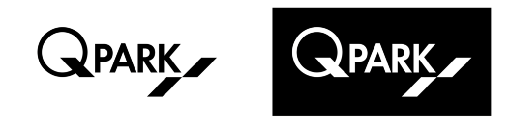
Colour
For wide-ranging applicability, clarity and strength, the use of colour in the logo is restricted to two colours: black (or white in reverse use) and red. For colour references, see the Primary brand colours section.
Figure 3 Logo in master and reverse version
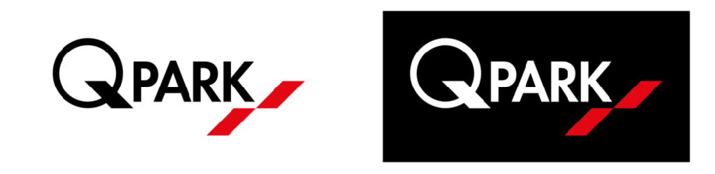
Figure 4 Logo in monochrome and reverse version
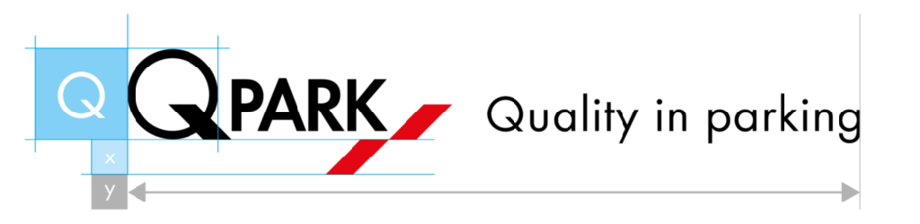
Q-Park logo and size parameters
We have 3 parameters for calculations within the house style, Q, x and y.
Q = the size of the large Q in Q-Park
x = the height of the angled parking space in the logo
y = the total width of the logo plus the payoff
All further calculations for the various templates and grids can be made using these values.
Figure 5 Definition of parameters Q, x and y