Digital guidelines
Online advertising
Bannering
Website
Job advertisements
A case study to recruit KE@Work students for two Business Intelligence projects.
Figure 75 Job advertisment - Recruitment case study 1
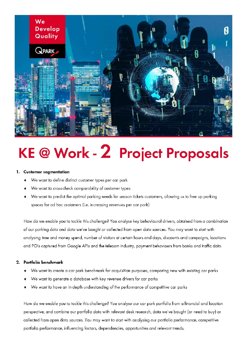
A case study to recruit KE@Work students for two Business Intelligence projects.