Primary typeface
The typeface used for Q-Park's Brand Identity is Futura T. This typeface must be used for all communication. We use:
Futura T 11pts
Line spacing 1.51
Futura T Demi for emphasis.
Futura T makes an efficient and clear impression. The design principles are non-decorative; it is a business-like, easy to read, no-nonsense typeface. If it is not possible to use Futura T, use Arial.
Download Q-Park fonts - Futura T & Futura T Demi
Futura T
Figure 28 Typeface Futura T
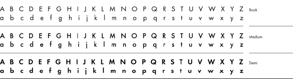

Note: Only Futura T, Futura T Demi and Arial are permitted.
In all Q-Park expressions, whatever the medium, the word and letter spacing may not be adjusted in any way, nor may the letters be widened, narrowed, skewed or modified.
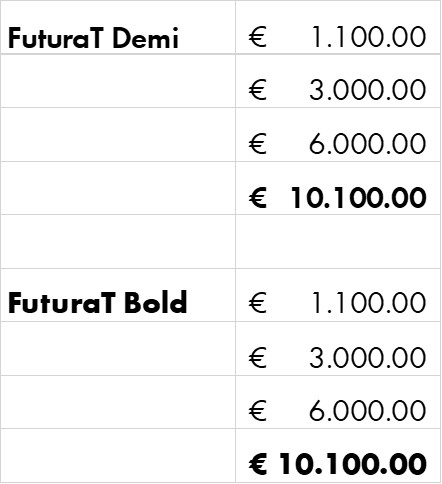
Do not use bold in Futura T for emphasis as this variant of the typeface does not space evenly. Instead use the Futura T Demi typeface which is naturally ‘bold’. The following visual shows the alignment differences (the bold number jumps too far to the left and is no longer aligned with the others), this may be confusing for readers, especially when tables become more complex.
Figure 29 Futura T Demi vs Futura T Bold
For emphasis in running text, you may use italics or Futura T Demi, however, do not underline text that will be read online or on screen because underline is reserved for links.
- Providing space is what we do, in our parking facilities and all other interactions with our customer groups; parking space supports the motorist, well-spaced copy supports the reader.